Lightning strikes twice
![]()
When I saw the two final design options for the new Wakefield Warrior logo presented at last week’s School Committee meeting, I’ll admit I was little relieved.
At least they decided to forgo the hammer and sickle.
Both of the new design finalists consist of a lightning bolt stylized as a “W.” So going forward, instead of a logo that can trace its roots back to one of Wakefield High School’s most distinguished alums, General John Rogers Galvin, we’ll have one that represents a common weather phenomenon that has no special connection to Wakefield.
That’s no knock on the faculty member who designed the two new logo finalists. She was tasked with designing a logo that wouldn’t offend anyone and wouldn’t violate any copyright or trademark – unlike that interim logo design that the School Department lifted from Ohio State University, drawing a stern warning letter from OSU’s attorneys. 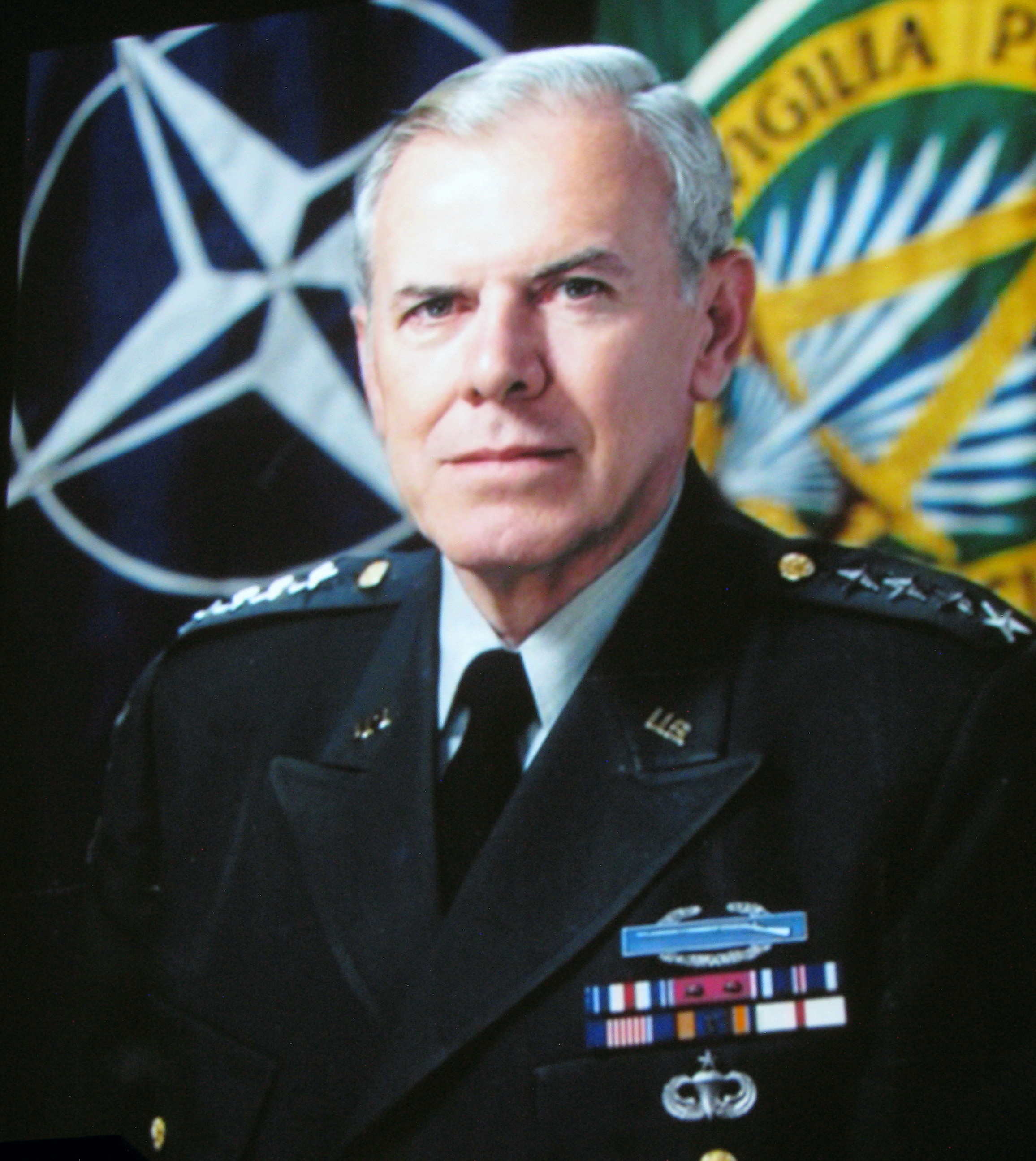
The future Supreme Commander of NATO, John Galvin, designed the first Wakefield Warrior logo back in 1947 when he was WHS Class Artist. His original black and white design appeared in the 1947 WHS yearbook. The design has evolved over the decades, but has always depicted an Indian warrior in a headdress.
Galvin’s classmate and lifelong friend was Richard Bayrd, of the Native American family that owned Bayrd’s Indian Trading Post at the head of the Lake way back in the 20th century. Richard Bayrd supported keeping the traditional Warrior logo right up until his death in 2021.
![]() But, in 2020, the kids on the Wakefield Youth Council decided that they knew better. The use of Indian warrior imagery was racist, they determined, and had to go after 74 years. They brought their conclusions to the adults on the School Committee, who dutifully cancelled any and all versions of traditional Warrior logo in March of 2021.
But, in 2020, the kids on the Wakefield Youth Council decided that they knew better. The use of Indian warrior imagery was racist, they determined, and had to go after 74 years. They brought their conclusions to the adults on the School Committee, who dutifully cancelled any and all versions of traditional Warrior logo in March of 2021.
And now, more than two years later, the School Committee will finally vote on a new WHS logo at its June 27 meeting. In the meantime, as chairman Tom Markham said at their last meeting, the School Committee would like to “hear from the community” as to its preference for a Wakefield Warrior logo.
I would like to remind the School Committee that “the community” already spoke loudly and clearly on April 27, 2021, when it voted in a town-wide referendum election to keep the traditional Warrior logo.
And let me remind everyone that the School Committee couldn’t be bothered waiting to “hear from the community” back in 2021, when they voted to deep-six the traditional logo just weeks before the scheduled referendum vote.
But this time, I’m sure they care very deeply what “the community” thinks.
I’ve been saying from the beginning that eliminating the old logo was just the beginning and the “Warrior” name will be the next to go. The proposed new logo only strengthens my suspicions.
I can hear it now.
“Well, you know, a lightning bolt really doesn’t have anything to do with a “Warrior.”
Then a group of 7th grade girls will tell the School Committee that warriors are mean, and that will be the end of that.
This is now how things are done in Wakefield.
—
[This column originally appeared in the June 15, 2023 Wakefield Daily Item.]
Filed under: Columns & Essays, Community, History, Humor, News, Opinion, Politics, Wakefield | 4 Comments
Tags: Bayrd's Indian Trading Post, Community, Daily Item, education, election, hammer & sickle, Humor, Indians, Indigenous People, John R. Galvin, lightning bolt, Mark Sardella, Native Americans, Opinion, Politics, Richard O. Bayrd, schools, vote, Wakefield, Wakefield Memorial High School, Wakefield School Committee, Warrior Logo. Wakefield MA, WHS, WMHS, yearbook, Youth Council

A well written summary of the controversy to date, and a purple heart to the teacher tasked with designing a new logo. My own personal objection to the warrior logo is that it has no roots in Wakefield’s culture or history. Yes, Richard Bayrd was a good man and good citizen, but he was only one man. There are Wakefield citizens of German, Italian, and Polish descent who are equally admirable citizens — why not make the logo a symbol of their ethnicity? The plains warrior logo has its roots in Hollywood, not Wakefield; it is exactly how John Ford and Howard Hawks envisioned plains warriors, and Wakefield’s warrior dates from a time when Hollywood westerns were at their most popular. My suggestion for a new logo is based on our weather: the Wakefield Nor’easters. There is a groundswell of support for my idea — I’ve persuaded three people to get behind it so far.
No.
Wakefield’s Warrior logo was designed in 1947, when a person who was 47 years old would have been born in 1900 (and possibly a WWI vet) and someone 70 years old would have been born in 1877. That person would have been 22 years old in 1889 when the Oklahoma Land Rush marked the end of the frontier. The 1890 census showed that the frontier line, where the population was less than two people per square mile, no longer existed.
Yes, the Bayrd family had their trading post at the head of the lake for decades afterwards, but back in 1947 there still would have been Indians who had lived “the old ways”, not in a house with indoor plumbing, electricity, and central heating.
It’s like old folk today who remember when there were no cell phones, when you had to have the operator assist you in making a long distance call. My guess is that the young Galvin & Bayrd realized that the older Indians were the last of a dying way of life and that they sought to memorialize them with the logos.
Shouldn’t that “group of 7th grade girls” be in quotes? Like the “15 yr-old girl” who was having nightmares over the word “Selectmen”? Because the REAL culprits never seem to have the spine to own their WOKE ideas.
Oh, the 7th grade girls will be put up to it by adults, like the Youth Council was with the logo. I should have mentioned that. 🙂